
Modern infrastructure projects are marvels of engineering and design, shaping our urban landscapes and connecting communities. From gleaming new transit hubs to expansive pedestrian zones and smart city developments, the focus is often on grand aesthetics, technological integration, and efficiency. Yet, within these ambitious blueprints lies a subtle, yet profoundly important, element that often goes unnoticed by the casual observer: tactile warning surfaces. These seemingly simple textures underfoot are not merely an afterthought; they are an indispensable component of inclusive design, seamlessly guiding and protecting millions of individuals with visual impairments. Integrating them effectively into modern infrastructure is a testament to thoughtful planning, prioritizing safety and accessibility without compromising on visual appeal.
The true beauty of tactile warnings lies in their “unseen” nature for the sighted, providing critical information without cluttering the visual environment. For those who rely on them, however, they are a language underfoot, speaking volumes about impending danger, directional changes, and safe passage.
The Silent Language: Understanding Tactile Warnings
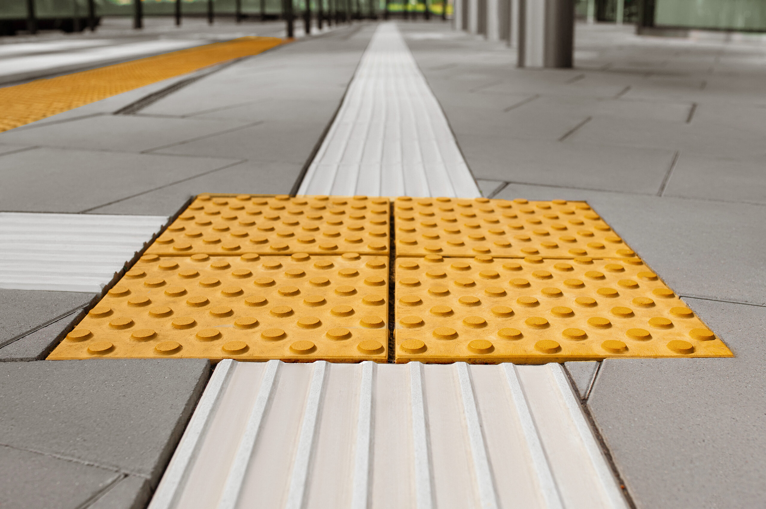
Tactile warnings, also known as detectable warning surfaces or truncated domes, are patterned ground surfaces that can be felt through footwear or a cane. Their primary purpose is to convey essential information to pedestrians who are blind or visually impaired, serving as a vital navigational aid and safety feature.
The most common types include:
- Warning Surfaces (Truncated Domes): These distinctive patterns of flat-topped domes are typically found at the edges of railway platforms, street crossings, and other hazardous areas. Their texture signals an imminent change in elevation or the approach of a dangerous zone, alerting individuals to stop and proceed with caution.
- Guidance Surfaces (Ribbed or Grooved Tiles): Less common in some regions but equally crucial, these linear patterns guide pedestrians along a safe path, particularly in large, open spaces or where a defined walkway might otherwise be ambiguous.
These tactile cues are standardized, ensuring that their meaning is universally understood by those who depend on them. The consistent application of these patterns is paramount; any deviation can lead to confusion, disorientation, or, most critically, endangerment.
Seamless Incorporation: Strategies for Modern Infrastructure
Achieving seamless integration involves thoughtful consideration of materials, colors, and placement:
- Material Consistency: Modern manufacturing techniques allow tactile warnings to be produced from a wide array of materials – concrete, stone, composite materials, and specialized polymers – that can match or complement the surrounding pavement. This assures a jarring visual distinction even as the tactile feeling is retained distinct.
- Color Contrast (While Maintaining Harmony): While the primary function is tactile, visual contrast is also important for individuals with low vision who may not be completely blind. The match is to create this contrast without confusing the aesthetics as a whole. This can be done by selecting colors from within the existing material palette but with sufficient luminosity contrast to be discernible, such as a slightly darker shade of grey against a lighter one, or a warm terracotta against a cooler beige.
- Strategic and Consistent Placement: The effectiveness of tactile warnings relies heavily on their precise and consistent placement according to established accessibility guidelines. This means ensuring they are always present at defined hazard points, such as the edge of a crosswalk ramp or a transit platform. Thoughtful urban design can sometimes create natural transitions or incorporate landscape elements that subtly frame these tactile zones, making their presence feel organic rather than forced.
- Integrated Design Features: Innovative projects are now seeing tactile warning patterns subtly incorporated into larger design elements. For example, a street artist might use varying textures in a mural that happens to align with the required tactile path, or a public plaza might feature an integrated pattern in its paving scheme that serves a dual purpose of design and warning.
Conclusion: Building a More Connected World
The seamless integration of tactile warnings into modern infrastructure projects represents a quiet revolution in urban design. It is a powerful example of how seemingly small, unseen details can have an enormous impact on the lives of millions. By moving beyond a mere checkbox requirement to an intrinsic design element, cities and developers are not just building roads, bridges, and plazas; they are building a more connected, safer, and truly inclusive world. The future of infrastructure isn’t just about what we see, but about the intelligent, empathetic details that speak volumes, even when they go unseen.


More Stories
The Unstoppable Mindset: How to Cultivate Greatness Within
Unlocking the Code to Greatness: Your Blueprint for Extraordinary Achievement
The Relentless Pursuit: How to Rewire Your Mind for Greatness